week 1 – “hello world with php” | source
week 2 – “candy survey with widgets” | source
week 3 – “working with the database” | source
so unfortunately not much happened with week 4 for me. i wanted to tackle the interactive prototype of the thermoclock, but time constraints and some actual outdoors time with sunlight allowed flash to kick my bum. the class discussions though are improving my perspective in a way i’m really appreciating, and i feel like i’m following the thread of instruction, even though what i’m producing seems to be behind or lacking. we were to wrap up the drilling down on the software side last week and open up physically to playing with the ipac this week. i let a stupid detail prevent me from cutting my teeth on the hardware, but i did get a chance to look into the code in the flash examples and navigate my way around the application a little more, which is somewhat satisfying. hopefully i’ll get to keep working with these tools, so i don’t have to relearn again. you can check the swf here.
1. this week’s assignment is a bit more open. we are to design / write a software prototype for usability testing. we have the option to work with the time piece from week one, the device from week two (thermo-clock in my case), or an original invention… it seems going with the thermo-clock makes the most sense for me, as i’ve already created a flat image of how i think the improved should look. the question is whether to work in processing (i had a recent class on this environment) or flash (which is pretty brand new to me, therefore perhaps more challenging, but something i want to have in my toolkit within the next year). i was torn, but with tutorials and such available, i think i’ll be ambitious and get started in learning flash. (more to come).
2. after a few hours of learning and playing with the basics of flash (…animation, layers, scenes, preload, buttons, etc), i hit a little wall. i wasn’t able to figure out how to use the time based looping method to have multiple binary switches function independently. since i’m hot and tired (and have another workday ahead, i’m going to relocate and try to get some of this guy built in processing… if i can remember that relatively quickly).
3. so the background is prepared. adding some interactive pieces shouldn’t be too difficult now.
…not too difficult, but still time consuming
the code i have so far is here.
the applet so far looks like this. the 3 toggles and light button work, sortof. :/
i really wanted to get this going in flash though…
the second assignment is to select a digital appliance, analyze its operation, and suggest improvements. i will need to use paper prototyping to user test the improvements.
part A – “predict”
tasks:
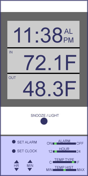
set the alarm time to 7:30 AM
find current and max outdoor temperature in fahrenheit and celcius
buttons:
[m] ode, [s] nooze/light, [mem] ory, [h] our, [min] ute, [al] arm on/off, [t] ime 12/24, [cf] temperature type
notation:
_ press and release, = press and hold, * repeat, # seconds to hold, $ switch
set alarm to 7:30 am: _[m], =#2[m], _[h]*7,_[min]*30, _[m]*2 or _[m], =#2[m], =~5[h],=~4[min],_[m]*2
find max outdoor temperature: _[mem], $[cf]
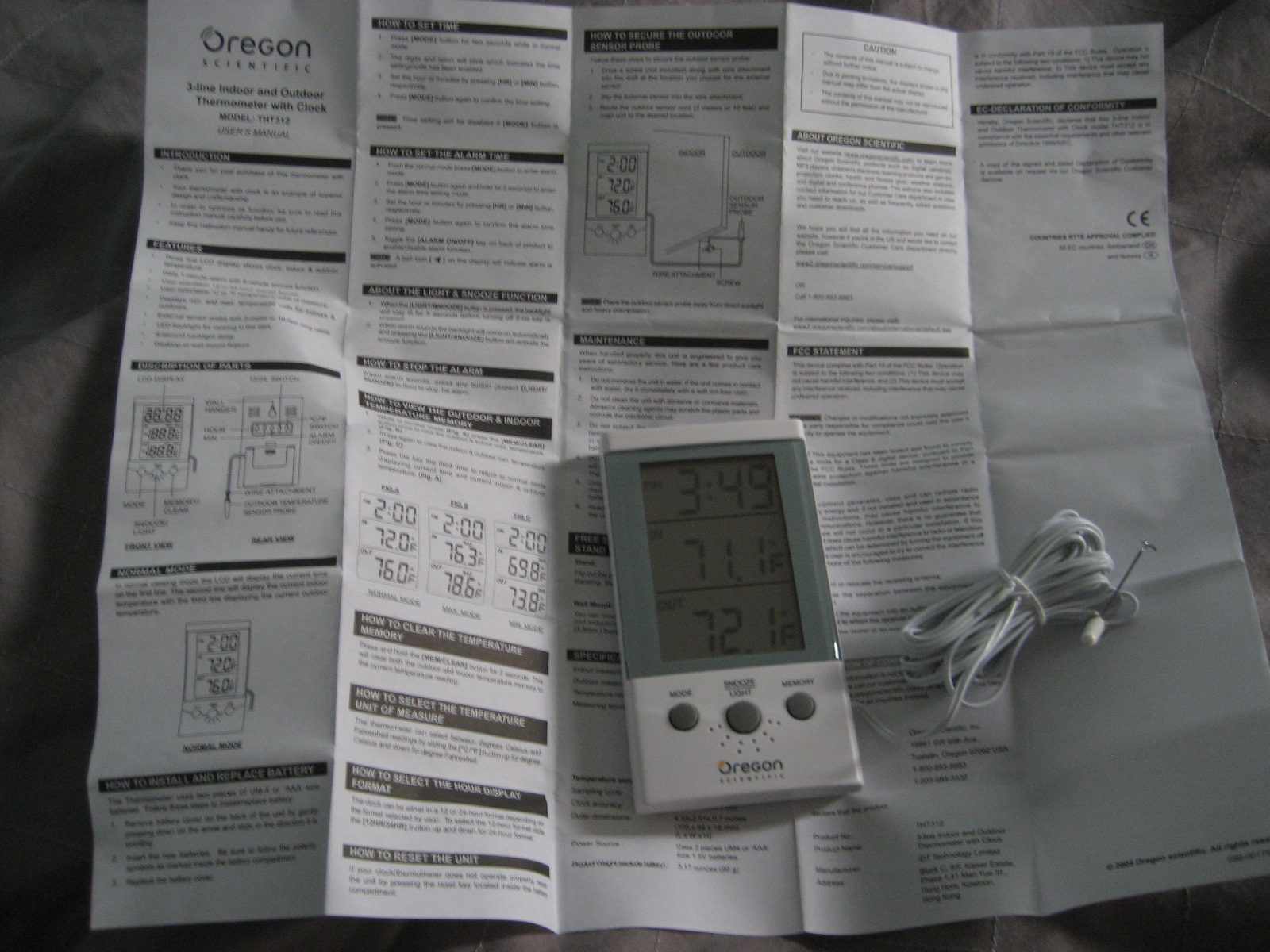
i selected this device because temperature and time (or lack of) have had unpleasant impacts on my state of being lately, but a warm vacation with leisure time are ahead (yes!). the thermometer/clock seemed pretty poorly designed, making it a nice object for critique and improvements. it was packaged in hard plastic, which is both difficult to open and dangerous. batteries were not included. there are 3 buttons located on the front, 3 buttons on the back, 2 switches on the back, and 1 reset pin inside the battery compartment. although the interface appears basic from the front view, my opinion is that users will find it most frustrating to operate.
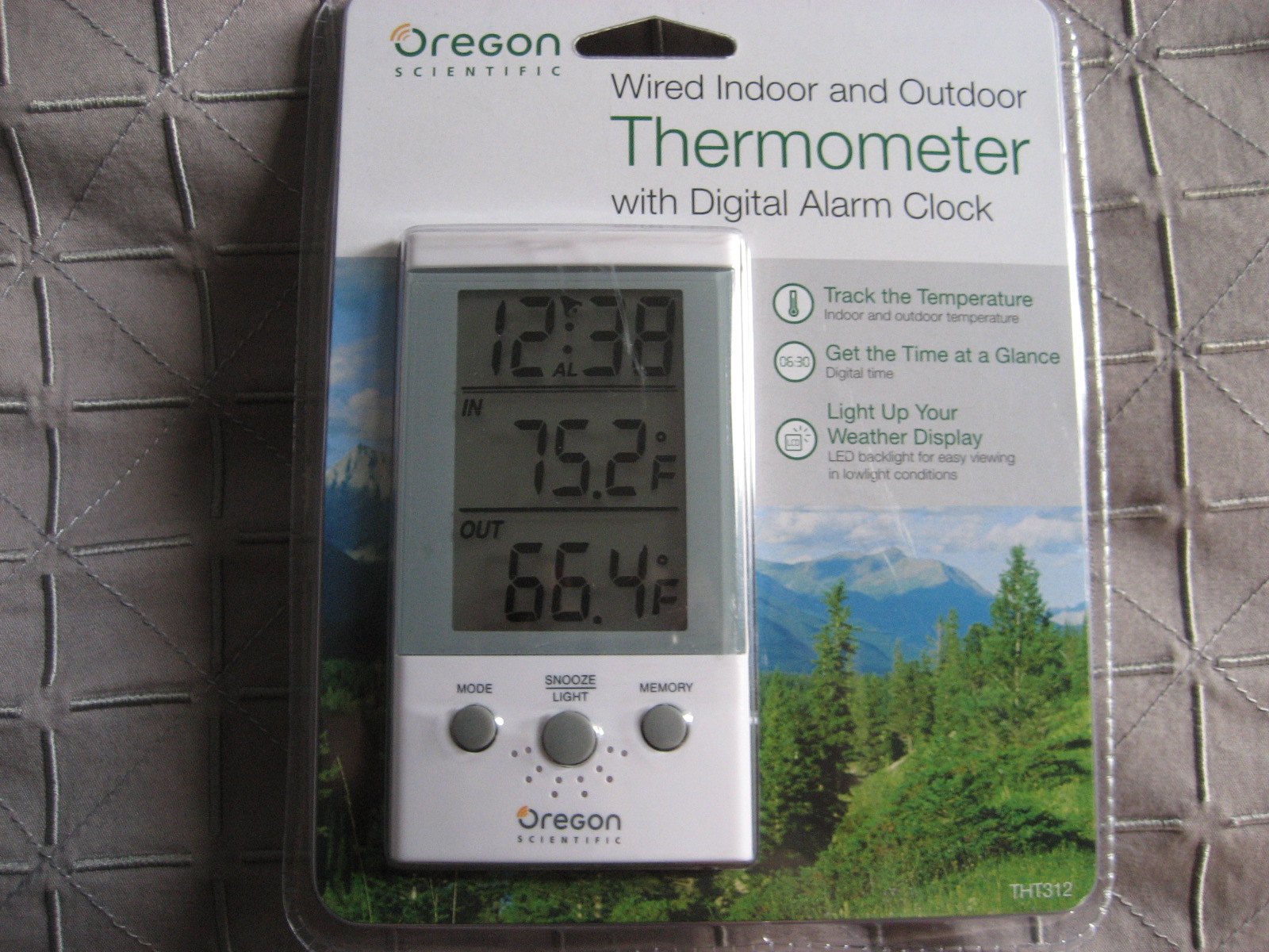
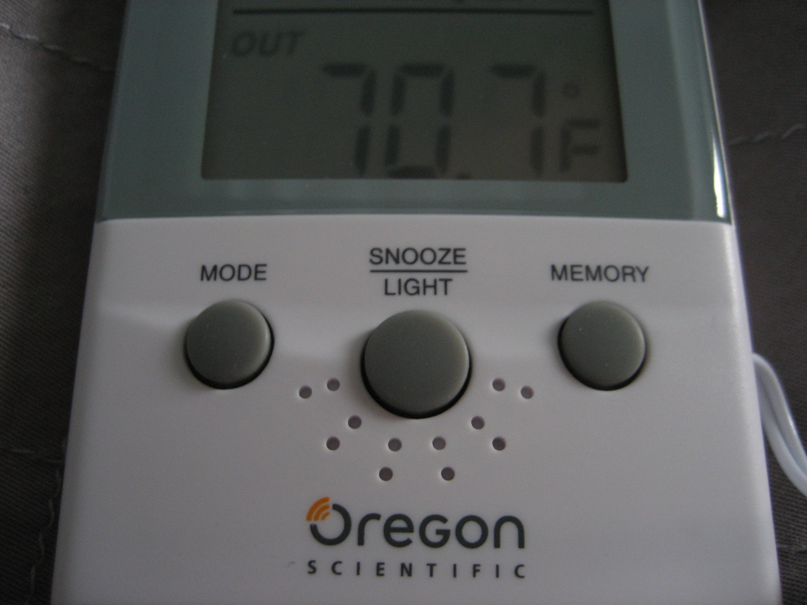
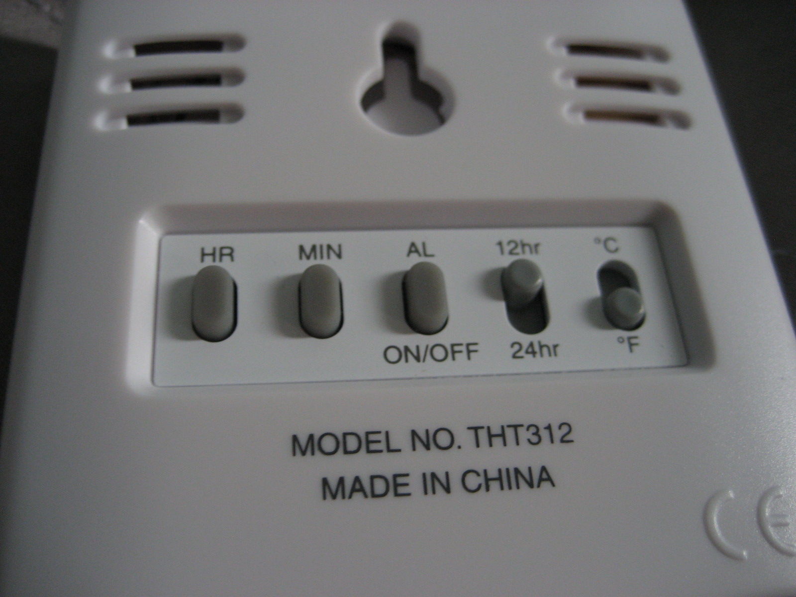
in setting the alarm, the user must understand the functions of the mode button. initially, it won’t be clear how many modes are present (3?), nor how pressing versus holding this button affects the progression. there are indicators that will blink or appear. the letters AL show the alarm mode, but a bell/ringer icon could cause confusion here as well. also, if in AM/PM mode, only PM appears on the display (including AM would eliminate some uncertainty). to adjust the digits, the user has to turn the device over to see the additional buttons at least once and then memorize the locations. to complete the task, the user must must move through at least 6 actions more likely around 50. due to the beeping sound with each press, and the pace of incrementation of the hours/mins, the level of frustration caused by this task could become very high. (video)
to view the temperature memory, the user must understand that the memory button is actually another mode button that cycles through 3 modes. the celcius/fahrenheit toggle is found on the back, so the user must turn the device around, which is not only another step, but would be very difficult if the device was mounted. also, the mode will default to normal if no action is taken in 15 seconds, so while turning over and back, the user could be frustrated by this as well. (video)
in general, i predict users will successfully complete the tasks within a couple minutes, but will be bothered by both the sound and the learning and actions that are required.
part B – “observe”
user 1 videos task 1 and task 2
user 2 videos task 1 and task 2
user 3 videos task 1 and task 2
as predicted, the users had difficulty understanding the mode button and it’s function. the beeping noise didn’t seem to bother them as much as i thought, but the turning the device over and back was inefficient. additionally, the min and max temperature function is essentially hidden, leaving the the [mem] button as a mystery button. the bell and AL indicators also led to confusion. i learned that the initial problem of holding the mode button was actually more of an obstacle than i thought too. a simple manual would have seriously helped the users complete the tasks, but without guidance, the device is frustrating and perhaps useless.
part C – “improve”
to improve this little object:
a. the controls and display need to be simultaneously visible. it seems the “back interface” was created to simplify the frontal appearance of the device. i would bring these controls to the front, but allow them to be covered with a sliding or flippable piece of plastic.
b. the mode and memory buttons sacrifice understanding for aesthetic appeal (?). i would remove them both and add controls that are self-explanatory, under the control cover. this should reduce the frustration with the mystery involved.
c. the hour and minute controls should be able to increment and decrement to allow the user to reach the exact time with more ease. this would eliminate the frustration of passing the specific hour or minute and needing to cycle through hours or minutes.
d. the indicators and labels are not all clear. i would remove the bell, which can be confused with the AL indicator. i would also include AM or PM, instead of only PM.
part D – “observe”
paper prototype and user test videos to come.
part E – “conclude”
surprises? accurate predictions? further enhancements?